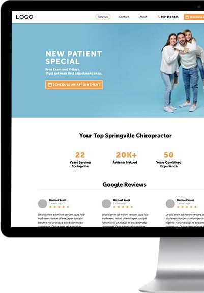
Your website is one of your biggest revenue generators. If set up properly, your website is like a powerful well-oiled machine, that can work for you and grow your practice 24 hours a day, 7 days a week.
When a patient views your website, you have only a few seconds to make a lasting impression on them.
Our brand new smart website template was built to convert more leads into patients without any added work to you or your team.
Our smart website template has the 5 key factors that all high-performing websites have in common.
Fast load time
Whether you’re 18 or 95, technology has made us used to getting instant access to information. Instant communication. Instant gratification. The average person will abandon their search if a website takes more than 3 seconds to load.
All your hard work spent building a website boils down to 3 seconds. Make it count.
Responsive design
Our world is increasingly becoming more mobile. If your website isn’t mobile responsive and user-friendly, your potential new patients can easily find another website that is. Competition is everywhere. Make sure you stay ahead of the curve.
Intuitive navigation
Make it easy for your patients to find the information they are searching for. If they want more information about your team, your services, your specialties, etc. don’t make it difficult to find or navigate through the pages.
Let them know exactly what they’re getting and what to expect from the get-go. High converting websites tell patients right off the bat what makes their services unique. The more your patients know what you do and what to expect upfront, the more trust is established and they’ll feel ready to make informed purchasing decisions.
Noticeable CTA’s (Calls to action)
Booking an appointment is the number one action taken for a healthcare practices’ website. You never want your potential new patients to say, “I’m interested, but what do I do now?” In other words, because there’s no CTA button, interested users won’t know how to take the next step towards conversion. You risk losing their interest or attention. The best converting websites display their CTA buttons early on and give patients plenty of opportunities to book an appointment. CTA buttons help guide them to the next step.
68 percent of patients say they are more likely to choose a practice that offers the ability to book, change, or cancel appointments online. If you’re worried about losing control of your schedule with online booking, check out our blog on how online scheduling gives you more control over your schedule.“Requesting” an appointment is an easy way to lose potential patients because no one wants to wait for a callback. People want to make a plan and then move on with their busy lives.
Attractive web design
You don’t want to go too overboard on design. You still want your website clean and easy to navigate. Use web-safe fonts but include eye-catching images, graphics, and videos. And make sure to include some personalization! Showcase what makes you unique by including photos of your team, your patients, and your practice and services.
Our customizable website template will have your calendar filled with new patients and allow you to create a beautiful, branded website in minutes. No coding or web design experience is needed. Schedule a call to learn more and start converting more leads today!

